How to Optimize Your Website’s Navigation for Better User Engagement
")
Websites are like digital doorways to your business. But what happens when users enter a doorway only to find endless, confusing corridors? They leave. And that’s exactly what poor website navigation can do to your user engagement and bounce rates.
Optimizing your website’s navigation ensures a seamless user experience, making it easier for visitors to find exactly what they need while boosting your site’s performance and SEO ranking in the process.
Whether you’re a website owner, designer, or digital marketer, this guide will walk you through actionable strategies to help you craft navigation that maximizes engagement and keeps users coming back for more.
Understanding Website Navigation and User Engagement
Website navigation is more than just a menu bar along the top of your screen. It’s the entire framework guiding users through your website, helping them locate information, products, or resources with minimal effort.
Why Navigation Matters:
- A clean and intuitive navigation structure reduces frustration, keeping visitors on-site longer.
- Websites with poor navigation often see higher bounce rates, as users leave when they can’t find what they’re looking for.
- Smooth navigation improves user engagement, leads to increased conversions, and positively impacts your SEO rankings. Search engines prioritize user-friendly websites, rewarding them with better visibility.
Think of navigation as the backbone of site usability. When it’s well-organized, users enjoy a better experience, which builds trust and keeps them exploring your content.

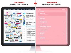
Best Practices for Designing an Intuitive Navigation Menu
Crafting the perfect navigation menu requires a mix of simplicity, clarity, and strategic placement. Here’s how you can create one that boosts engagement across your website.
1. Prioritize Simplicity and Clarity
- Keep Labels Clear: Avoid creative but confusing terms. Stick to straightforward labels like “Contact Us” or “Shop Now.”
- Limit Categories: Aim for 5–7 main menu items. Overloading the menu can overwhelm users.
2. Ensure Consistency
- Make sure navigation menus are consistent across every page. A stable, predictable structure builds familiarity and prevents frustration.
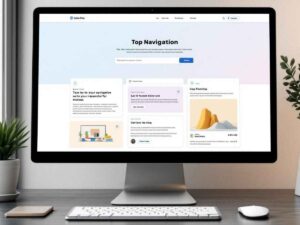
3. Position Strategically
- Your navigation menu should be easy to spot. Place it at the top of the page or as a sticky menu so it’s always accessible, even when users scroll.
4. Add a Search Bar
- For larger websites, include a search bar feature to allow users to find specific content quickly.
5. Avoid Clutter
- Don’t stuff your menu with links to every page. Reserve the menu for key sections, using dropdowns to organize subcategories when necessary.

Making Your Navigation Mobile-Friendly
With over 50% of global website traffic coming from mobile devices, mobile-friendly navigation is no longer optional.
Mobile Navigation Best Practices:
Use a Hamburger Menu
- This compact icon saves screen space and houses all navigation options in a collapsible menu.
Ensure Thumb-Friendly Design
- Place navigation elements within easy reach of a thumb, typically near the middle or bottom of the screen.
- Your navigation should adapt seamlessly to different screen sizes. Test your mobile design across various devices to ensure every user has a smooth experience.
Simplify for Mobile Users
- Streamline links and minimize layers of navigation to help users reach their intended destination with fewer clicks or taps.
Improving Site Architecture for Better Navigation
Your navigation’s success depends heavily on your site architecture. A clear, logical structure makes it easier for both users and search engines to explore your site efficiently.
Tips to Enhance Site Architecture:
Use a Logical Hierarchy
- Organize content into main categories, subcategories, and individual pages to simplify navigation.
Breadcrumb Navigation
- Include breadcrumb trails to help users retrace their steps with ease.
Internal Linking
- Incorporate internal links within your content to guide users to related pages and keep them engaged for longer. This also provides an SEO boost by improving site crawlability.
Optimize URLs
- Structure URLs with clarity, making them readable for both users and search engines. For example, a product page URL like /shop/winter-jackets is more intuitive than a random string of numbers or characters.
Optimizing Calls to Action (CTAs) in Navigation
CTAs play a pivotal role in driving user engagement. When seamlessly integrated into your navigation, they can subtly guide users toward desired actions without feeling pushy.
Keys to Effective CTAs:
- Use Action-Oriented Text
- Phrases like “Get Started,” “Subscribe Now,” or “Book a Demo” encourage immediate action.
- Strategic Placement
- Place CTAs where they’re most likely to catch attention, such as the top right corner of the menu or towards the bottom in sticky navigation.
- Highlight Value
- Make it clear why users should click, such as “Save 20% Now” or “Explore Our Free Trial.”
Using Visual Design to Enhance Navigation
Good navigation isn’t just about functionality—it’s also about aesthetics. Visual design elements help create an intuitive and enjoyable experience.
Design Tips for Better Usability:
Color and Contrast
- Use contrasting colors to make the navigation menu stand out. Ensure excellent readability for all text.
Font Size and Style
- Use legible fonts with appropriate sizes for easy scanning. Avoid overly decorative or hard-to-read styles.
Icons and Visuals
- Icons add an extra layer of understanding. For example, a shopping cart icon signals the checkout process.
Visual Hierarchy
- Use size, bolding, or color to emphasize primary links and CTAs, guiding users intuitively through your menu.
Monitoring and Analyzing Navigation Performance
Even the most well-designed navigation can benefit from regular testing and optimization. By analyzing user behavior, you can identify areas for improvement and ensure your navigation remains effective.
Tools and Techniques:
- Heatmaps
- Tools like Hotjar or Crazy Egg show where users click and how they interact with your navigation.
- User Testing
- Gather feedback directly from users to pinpoint pain points in your navigation system.
- Analytics
- Use platforms like Google Analytics to track metrics like bounce rates, session durations, and behavior flows to evaluate your navigation’s effectiveness.
- A/B Testing
- Test variations of your navigation structure to see what resonates most with users.
Better Navigation = Better Engagement
Optimizing your website’s navigation is one of the most impactful ways to boost user engagement, reduce bounce rates, and guide users to take desired actions.
Don’t underestimate its significance. A user-friendly, visually appealing layout isn’t just good for your audience; it positions your website as professional and trustworthy, giving you a crucial advantage in today’s competitive digital landscape.
Now’s the time to review your site’s navigation structure, make adjustments based on the tips above, and watch as your user engagement soars.
FAQs
- Why is website navigation so important?
Website navigation is crucial because it directly impacts user experience, making it easier for visitors to find the information they need. A well-structured navigation system helps reduce bounce rates, improves user engagement, and establishes your site as professional and trustworthy.
- How can I tell if my navigation layout needs improvement?
Signs of poor navigation include high bounce rates, low time spent on pages, and user complaints about difficulty finding information. Regularly review site analytics and conduct user testing to identify areas needing improvement.
- What is the ideal structure for website navigation?
The ideal structure should be simple, intuitive, and consistent. Use clear headings, limit menu options to avoid overwhelming users, and consider placing essential links in prominent locations such as the header or footer.
- How does good navigation affect my website’s SEO?
Good navigation improves SEO by helping search engines index your site efficiently. It ensures that internal links are easy to follow and creates a logical site hierarchy, which improves visibility in search engine results.
- Are there tools or resources to help optimize my site’s navigation?
Yes! Tools like Google Analytics, Hotjar, and user feedback surveys can help identify problem areas. Additionally, website builders and content management systems often offer pre-built templates with optimized navigation structures to guide you.


